
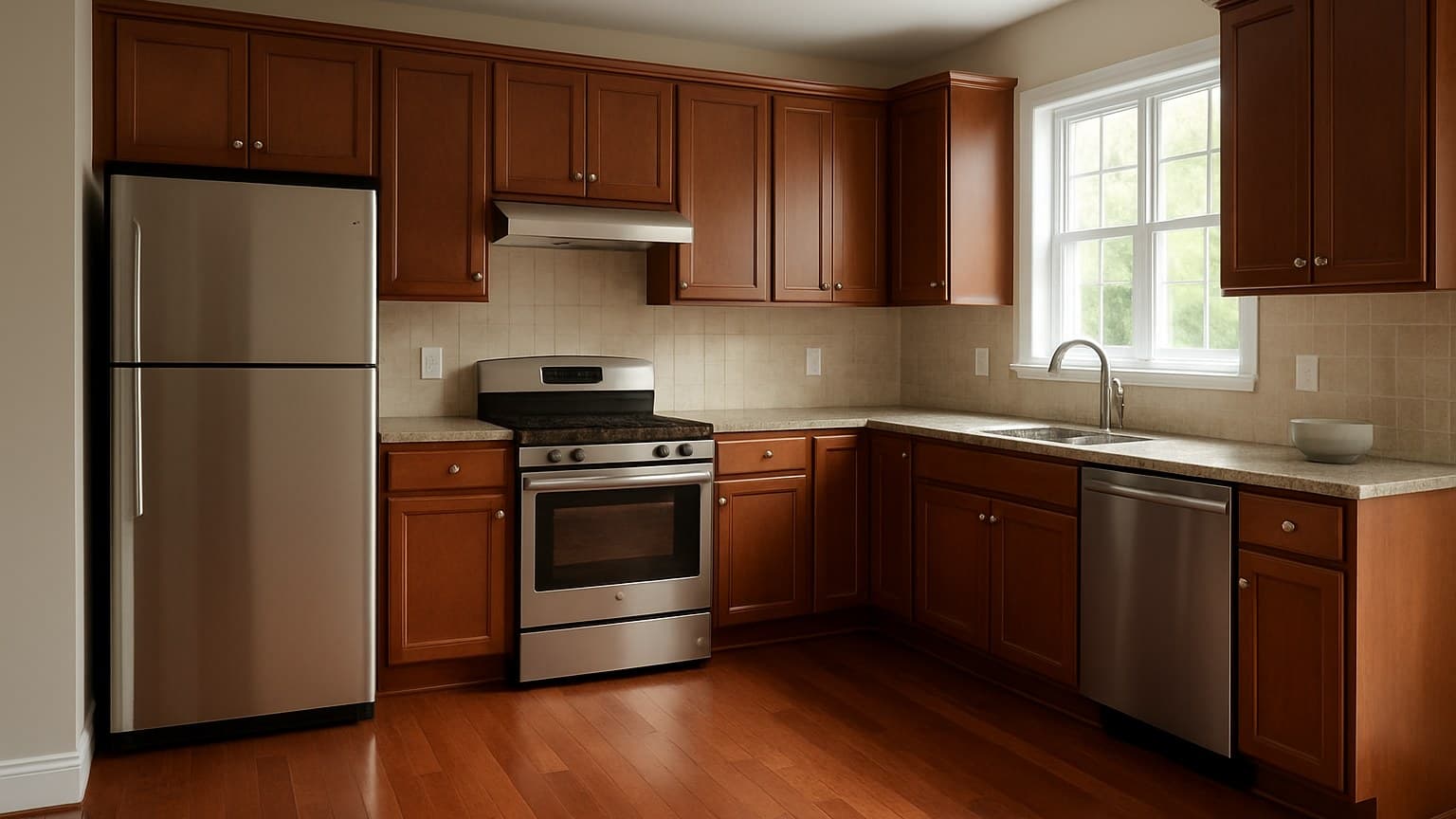
The plank rarely fails the room. What fails is dropping cherry vinyl flooring next to the wrong cabinet or wall color, then only noticing once everything's installed and paid for. Below are 7 pairings that flatter a red-brown floor and 3 that fight it, pulled straight from a cherry LVP kitchen I laid for the Delgado family in Tulsa and the living rooms I've matched to it since.
Key takeaways
- Cherry vinyl loves contrast: white or off-white shaker cabinets and cool slate or gray-blue walls let the red read as a warm accent instead of taking over the room.
- The biggest clash is wood-on-wood: cherry floor plus cherry cabinets blurs into one heavy red mass, and honey oak trim fights the red undertone.
- Icy, blue-cool grays fight cherry's warmth and make the floor look orange by contrast; warm grays and greige work far better.
- Match the undertone first, not the word 'cherry' - a brown-leaning plank pairs with different colors than a bright red-leaning one.
- Matte black accents, navy, sage, and warm brass hardware all pull cherry out of dated territory and into current, grounded rooms.
Start Here: Pair the Undertone, Not the Word "Cherry"
"Cherry" is not one color. It runs from bright, red-leaning planks to muted, brown-leaning ones, so the color you pair against depends on which plank is actually on your floor, not on the word on the box.
The one rule that carries this whole article: cherry wants contrast, not more warm wood sitting next to it. Almost every pairing that works puts something cool, crisp, or dark against the red. Almost every one that fights piles another warm tone on top of it.
Before you pick a wall color, figure out your plank's undertone. If you're still choosing the plank itself, the shade-by-shade cherry vinyl breakdown sorts red-leaning from brown-leaning so you know what you're pairing against. And keep this straight: cherry is a color choice, not a durability tier. What decides how long a vinyl plank actually lasts is the wear layer and the prep under it, not the shade.
Here's the cheat sheet if you want your answer before reading the rest.
| Pairing | Verdict | Why |
|---|---|---|
| White / off-white shaker cabinets | Works | Clean contrast, red reads as accent |
| Slate / gray-blue walls | Works | Cool wall calms the warm floor |
| Creamy off-white walls and trim | Works | Warm-on-warm without clashing |
| Sage or muted green | Works | Green sits opposite red, flatters it |
| Matte black accents | Works | Grounds the room, feels current |
| Navy | Works | Deep cool anchor for warm red |
| Brass hardware + leather | Works | Warm metals echo the red tone |
| Cherry cabinets | Fights | Wood-on-wood, one heavy red mass |
| Honey oak trim / doors | Fights | Two warm woods argue, reads dated |
| Icy cool-gray walls | Fights | Cold gray makes the floor look orange |
Source: the cherry LVP kitchens and living rooms I've fitted around white, wood, and painted cabinets
A quick-glance guide to which cherry vinyl floor pairings flatter the red and which ones clash.
Works: Cherry Floor + White Shaker Cabinets
White shaker cabinets are the safest rescue for a cherry floor. The crisp white breaks up the warmth and lets the red read as a deliberate accent instead of flooding the whole room.
This even saves a dark, Brazilian-cherry-look plank that would otherwise feel heavy. One thing worth knowing: a real Brazilian cherry hardwood floor keeps darkening for years after you lay it, while the vinyl version holds the color it came with, so what looks balanced on install day stays balanced. If you're weighing real wood for an adjoining room, the solid vs. engineered hardwood flooring guide covers picking the right construction and species to keep that transition looking intentional.
One practical tip from the field: pick a warm white, not a stark blue-white. A cold, icy white cabinet next to a warm red floor makes both look off. A creamy or greige-white lets them sit together. This combo also shows well when it's time to sell.
Works: Cherry Floor + Slate or Gray-Blue Walls
A cool wall is the easiest low-risk move for a nervous homeowner. Slate and gray-blue balance the warm floor so neither one shouts, and the room feels settled instead of loud.
Stay in the safe range: warm-leaning grays, slate, and gray-blue. Skip icy, blue-white grays, which get their own fight section below.
This pairing shines in living rooms and bedrooms with decent daylight. Cool colors go flat and gloomy in a dark room, so test the actual swatch on your own wall, in your own light, before you commit to a gallon. If the chip still reads calm and slightly warm under your own bulbs, it'll work with the floor. If it turns flat or blue-gray, go back to the safe range from above instead.
Works: Cherry Floor + Creamy Off-White Walls and Trim
Warm-on-warm can work when the wall is soft and light, keeping the red floor as the star of the room. A creamy off-white wraps the space without competing.
Here's a detail most people miss: creamy trim beats bright white trim over a warm floor. Bright white trim can look jarring against cherry, almost like it doesn't belong. A softer cream reads more cohesive.
The watch-out is yellow. Skip creams that lean heavy yellow, because they push the whole room toward orange and drag the floor with them. This look lands best in traditional and transitional rooms.
Works: Cherry Floor + Sage or Muted Green
Green and red sit opposite each other on the color wheel, so a muted green flatters cherry instead of fighting it. It's the same reason cherry wood and green plants look right together.
Use it on cabinets, a feature wall, or upholstery. All three work as long as the green does the calming and the floor stays the warm note.
Keep the green muted and grayed, like sage or a soft olive, not a bright kelly green. A loud green stops flattering the floor and starts competing with it.
Works: Cherry Floor + Matte Black Accents
Matte black is a fast way to pull cherry out of a dated 2000s look. Black fixtures, an island, or window frames ground the warmth and read modern next to the red.
Go matte, not glossy. Glossy black over a red floor gets busy and shows every smudge and reflection, while matte sits quiet and hides a less-than-perfect light.
Use it in small doses, hardware, lighting, or a single island, so the room doesn't go heavy and cave-like. A little black anchors cherry. Too much of it swallows the space.
Works: Cherry Floor + Navy
Deep navy is a cool anchor that makes warm red look intentional instead of accidental. The contrast does the heavy lifting.
It lands best on a navy island, lower cabinets, or an accent wall, where it grounds the bottom of the room and lets the floor glow.
Pair it with warm brass or plenty of white so the navy-and-cherry combo doesn't go too dark and close in. Kept balanced, this one ages well.
Works: Cherry Floor + Brass Hardware and Leather
Warm metals and leather echo the red undertone instead of fighting it, giving a collected, lived-in look. This is the "on purpose" version of warm-on-warm.
Brass beats chrome or nickel here. Warm-to-warm feels harmonious, while cool metals over a warm floor can look like they landed in the room by accident.
For furniture, tan and cognac leather pull the whole thing together and pick up the red without matching it. This pairing is at its best in living rooms and dens where you want the space to feel gathered over time.
Fights: Cherry Floor + Cherry Cabinets
Here's the plain verdict: a red wood floor under red wood cabinets blurs into one heavy red mass with no visual break. Your eye has nowhere to land.
I got called back to a job in Broken Arrow where the homeowner had already ordered cherry cabinets to match her new cherry floor, and it dated the room fast. Everything read as one dark, warm blob, and the space felt smaller and older than it was.
The fix is to break the wood-on-wood. Painted cabinets, or at least a contrasting counter and backsplash, give the eye that break and let the floor be the warm feature instead of half of a red-on-red wall.
Contrast on the left keeps the floor and cabinets separate; matching tones on the right merge into a single red block. Not drawn to scale.
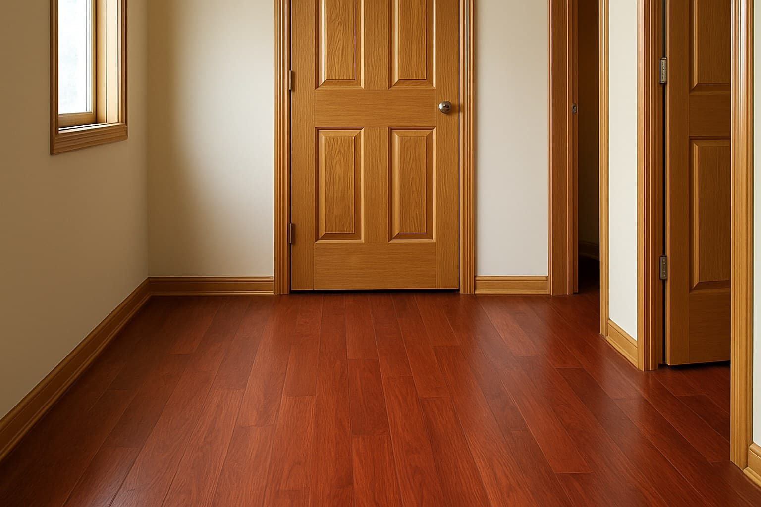
Fights: Cherry Floor + Honey Oak Trim and Doors
The verdict: two warm woods with different undertones argue, and the orange-honey oak makes the cherry look muddy. Red and orange next to each other cancel each other out.
This is a classic builder-grade leftover. You put down a nice cherry floor and the room still has the honey oak trim, doors, and railings from twenty years ago, and it drags the whole space back in time.
The fix is usually paint. Painting the trim and doors a warm white stops the fight. If you're set on wood tones and don't want paint, don't mix, choose one oak floor throughout instead of setting cherry against honey oak. Honey oak trim next to a cherry floor is two warm woods arguing, and the room loses the fight.
Fights: Cherry Floor + Icy Cool-Gray Walls
The verdict: a blue-cool gray fights cherry's warmth and, by contrast, pushes the floor toward orange. The colder the gray, the more the floor looks like a pumpkin.
This is why the "gray everything" trend backfires specifically over a warm red floor. Cool gray was built to sit next to cool-toned floors, and cherry is the opposite of that.
The fix is easy: swap to a warm gray, greige, or a slate that has some brown in it. Quick test before you buy, hold the paint chip flat on the floor in daylight. If the gray suddenly looks blue and the floor looks orange, put it back.