
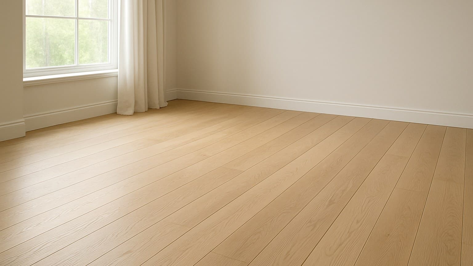
When homeowners ask me to redo the floors in an older ranch-style house, they usually want one straight answer: a color they'd never regret. My answer is almost always medium brown, it hides dust and scratches at the same time and never fights whatever furniture or paint comes next. After years of ripping up floors that dated in under a decade, I've learned the undertone matters more than the shade name on the box. Get that part wrong and you'll count every scratch by year two. If you're tackling that kind of redo yourself, step-by-step hardwood installation guide walks through getting the subfloor and layout right before the color even matters.
Key takeaways
- Medium brown and natural oak are the safest picks across every material: they hide wear, dust and scratches and read neutral to buyers.
- Greige (a warm gray-beige) has aged far better than the pure cool gray that peaked around 2015-2020 and now looks dated.
- Dark walnut and espresso look rich but show every speck of dust, pet hair and scratch, so they carry the highest upkeep of any shade.
- Floor color barely moves an appraisal; broad appeal, condition and a consistent neutral tone matter far more than the exact shade.
- Match the floor's undertone (warm vs cool) to your cabinets and walls; a mismatched undertone dates a room faster than the color itself.
First, What "Never Goes Out of Style" Really Means
Timeless and popular are not the same thing, and mixing them up is how people end up regretting a floor. Popular is what's selling hard right now. Timeless is a color that still looks right 15 years later because it reads neutral, forgives daily mess, and doesn't fight the rest of the room.
Every shade I'd call timeless passes three quick tests. It has a neutral undertone instead of a bold or trendy tint. It hides everyday dust, hair, and fine scratches. And it works with almost any cabinet and wall color you might pick down the road, not just the ones you have today.
One thing that trips people up: the color you choose does not change what installation costs. The material and the labor set the price, not the stain. So pick your shade for how long it will look good, and worry about budget when you pick the material. If you want the trend side of this instead, see what is the most popular floor color right now for where the market is leaning this year.
1. Natural Light Oak: The Pick for Small, Dark Rooms
Light, honey-toned oak is my first suggestion for any small or north-facing room. It bounces daylight around instead of soaking it up, so a tight space feels bigger and brighter. It also hides dust well between cleanings. If you want that same honey tone without solid wood's moisture sensitivity, our best engineered hardwood flooring picks cover options that hold up better in those tighter, damper spaces.
It holds the look across materials too. You get it in real red and white oak hardwood, and in plenty of light-oak LVP (luxury vinyl plank) and laminate that copy the grain closely. If you're weighing that light-oak vinyl against a maple look instead, I compare the two head-to-head in blonde maple vs. blonde oak vinyl plank.
One species note worth knowing. Red oak leans warm and slightly pink, while white oak reads cooler and more neutral. That undertone changes what the floor pairs with, so it's not just "oak is oak." If you're drawn to the palest end of this range, I broke down where that trend sits in are blonde floors in style.
2. Medium Brown: The Universal Wear-Hider and Safe Resale Bet
If I had to pick one color that never causes regret, it's a medium brown. It sits in the sweet spot that hides light dust and dark scratches at the same time. Light floors hide dust but show scuffs; dark floors do the reverse. Mid brown splits the difference. That balance holds whether you go with solid planks or engineered boards, though the two options differ enough in cost and stability that it's worth reading engineered vs solid hardwood comparison before you commit to either.
It also works in every material I install: hardwood, LVP, laminate, wood-look tile, even a brown-toned carpet. There's no room or style it clashes with. If hardwood is the material you're leaning toward, I walk through picking the right build and species in solid vs. engineered hardwood floors.
Living rooms are where this pick earns its keep the most. It's usually the highest-traffic room in the house, sitting under a mix of window light and lamp light that shifts through the day, and it has to survive kids, pets, and furniture getting rearranged more than almost any other room. Medium brown handles that mixed light without looking washed out or too dark, and it hides the everyday wear a living room takes better than a color at either extreme.
That's why it's my go-to for nervous clients. Buyers rarely react against a medium brown floor, so it's a safe bet if resale is anywhere in your thinking. Nobody walks in and pictures tearing it out.
3. Greige, Not Gray: The Trend Debate, Settled
Here's where I'll settle an argument you'll see all over the internet. Pure cool gray floors peaked roughly in the mid-to-late 2010s and now read dated fast. Greige, which is a warm gray-beige, has aged better and still looks current.
The difference is the undertone. Cool gray has a blue base under it, and that blue is what makes a room feel cold and instantly "of that era." Greige carries a warm beige base instead, so it forgives more furniture and wall colors and doesn't lock you into one look.
You'll mostly see greige in LVP, laminate, and tile rather than solid hardwood, since real wood doesn't take a gray tone naturally. For the vinyl-specific picks in this family, I go deeper in what color LVP is trending in 2026.
4. Dark Walnut and Espresso: Timeless Look, Real Upkeep
Deep brown and near-black floors do stay classic, and I won't pretend otherwise. In a formal, well-lit room they look rich and expensive. The catch is what that look costs you in daily upkeep.
Dark floors show everything. Every speck of dust, every hair, every footprint, every fine scratch stands out under the light. This shade needs more cleaning than the others here. Go in knowing you'll dust or vacuum more often, keep felt pads on furniture legs, and put a mat at every door.
Two things soften the pain. Choose a matte or brushed finish over gloss, because gloss magnifies both scratches and dust. And keep dark floors out of small or dark rooms, where they close the space in and make it feel like a cave. Save them for bright, larger rooms that can carry the weight.
5. Warm Neutral Carpet: Timeless Underfoot for Bedrooms and Stairs
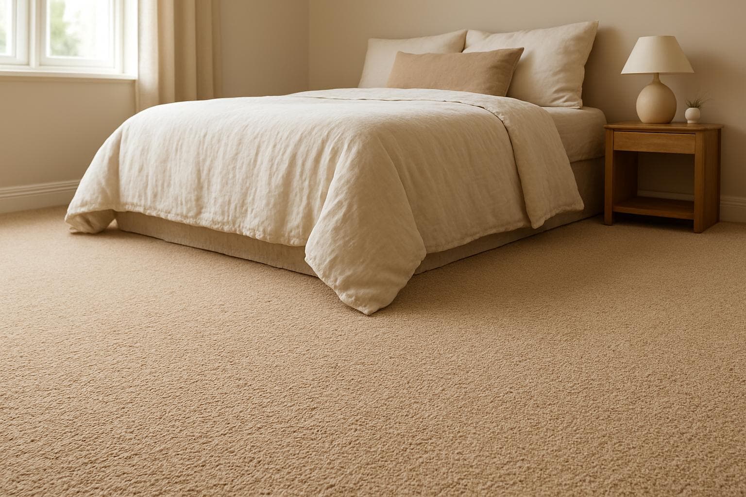
For bedrooms and stairs, treat carpet as a neutral canvas. The Carpet and Rug Institute's own guidance on selecting carpet frames it the same way, treating carpet as a backdrop for the room rather than the focal point. Soft beige, greige, and warm taupe stay timeless, while bold colors date fast and fight whatever you put in the room.
Look for solution-dyed fiber when you shop. According to the Carpet and Rug Institute, solution-dyed fiber has color built into the fiber itself rather than sprayed onto the surface, so it resists stains and fading and holds the same shade longer. It's the difference between carpet that still looks right in year eight and carpet that goes blotchy.
My advice: keep the wall-to-wall carpet neutral and let a rug carry any bold color you love. A rug is cheap to swap when you get tired of it. A full carpet is not.
6. Neutral Stone- and Wood-Look Tile: Timeless for Kitchens, Baths and Entries
In kitchens, baths, and entries, the timeless tile tones are soft white, greige, and natural stone colors, ideally in a matte finish and large-format (bigger tiles with fewer grout lines). These read calm and clean and don't tie the room to a trend.
The fastest way to date a tiled room is a busy pattern or a strong color in the field tile, the main tiles that cover most of the floor, not the trim or border pieces. What looks bold in the showroom looks tired in five years, and tile is expensive and messy to replace. Keep the main floor neutral and save any personality for something easy to change.
One detail people skip: match the grout undertone to the tile. A grout that's close in tone lets the floor read as one calm surface. A contrasting grout turns it into a busy grid you'll notice every day.
7. How to Match Floor Undertones to Your Walls and Cabinets
Every floor color is either warm (yellow, red, or beige base) or cool (gray or blue base), and matching that undertone to your cabinets and walls matters more than the color name. A mismatched undertone dates a room faster than the actual shade ever will.
The test I use on every job is simple. Lay a large sample of the floor flat against the actual cabinets and wall, in daylight, and look at it for a day. Don't judge from a small chip under store lighting, store lights lie and a two-inch sample tells you nothing.
The trap I see most is a warm-undertone floor fighting cool-gray cabinets, or the reverse. Each one looks fine alone, but together they make the whole room feel off, and most people can't say why. Undertone is the reason.
Does Floor Color Actually Affect Resale?
Honestly, not much on its own. No retailer or appraisal source pins a dollar figure to a specific floor color, and color rarely shows up on an appraisal at all. So don't choose a shade expecting it to raise your home's value by some amount.
What actually helps resale is broad appeal, good condition, and one consistent neutral tone running through the main floor. A buyer wants to picture their own stuff in the space, and a calm neutral lets them do that.
Where color hurts is the flip side. A bold or clearly dated floor can slow a sale, because buyers start doing math on what it costs to tear out and replace. That's the real risk, not a lower appraisal.
Timeless Color by Material: The Full Comparison
Here's the grid I wish someone had handed me early on. It rates each timeless color on upkeep, resale appeal, and room-light fit across every material, so you can read your own room off one table instead of scrolling every section.
| Color | Works in | Maintenance | Resale appeal | Best room light |
|---|---|---|---|---|
| Natural / light oak | Hardwood, LVP, laminate | Low, hides dust | High | Best for small or dark rooms |
| Medium brown | All materials | Lowest, hides dust and scratches | Highest | Works in any light |
| Greige (warm gray-beige) | LVP, laminate, tile | Low to medium | High | Good in most rooms |
| Dark walnut / espresso | Hardwood, LVP, laminate | High, shows dust and scratches | Medium | Bright, larger rooms only |
| Warm neutral (carpet) | Carpet | Medium, spot-clean | Medium to high | Bedrooms, stairs |
| Soft white / stone neutral (tile) | Tile | Low, grout needs care | High | Kitchens, baths, entries |
How six timeless floor colors compare on upkeep, resale appeal, and room-light fit across hardwood, LVP, laminate, tile, and carpet.
The ratings are qualitative on purpose, based on patterns I've tracked across real installs over the years, not invented scores.
Sources
- NWFA: Homeowners Handbook to Real Wood Floors
- Carpet and Rug Institute: Selecting the Right Carpet
- Carpet and Rug Institute: Modern Carpet Trends
- Carpet and Rug Institute: How Carpet Helps You Create a Healthy, Stylish, Comfortable Home
- Carpet and Rug Institute: Finding the Right Carpet